Bitcoin Netflows Of Past Dead Cat Bounces Compared
As pointed out by a CryptoQuant , a look at the BTC netflows of the past cycles may reveal the pattern that dead cat bounces have followed historically.The Bitcoin exchange “netflow” is an indicator that’s defined as the difference between the inflow and the outflow.
Now, here is how the 2018 dead cat bounce looked like with the netflows:

The Bitcoin netflows during 2018As you can see in the above graph, the indicator showed highly positive values during the formation of the dead cat bounce in 2018.

The dead cat bounce of 2019Similarly to the other chart, here too the move up ended up as a dead cat bounce as Bitcoin inflows dominated on exchanges. However, as soon as the netflows started decreasing and eventually turned negative, the price saw a sharp increase.
Related Reading | Quant: Bitcoin Indicators Now Look Similar To Q4 2020, Big Move Ahead?
Now, here is a chart of what happened in 2017:
Bitcoin price in 2017 vs the netflowsHere when the peak happened, the netflows were also highly positive and so the price fell. But the inflows also sharply dropped off soon after and what followed was a big price move up.
Related Reading | Bitcoin Bearish Signal: On-Chain Data Shows Whales Have Started Selling
Finally, how do the 2021 netflows look like?
Bitcoin netflows right nowThe peak that formed after the ATH this year was indeed a dead cat bounce as the highly positive netflows confirm. However, it’s different this time. The netflows look to be severely negative now. With these values, it looks more likely that the trend will be similar to 2017 where negative netflows took the price up.
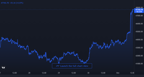
At the time of writing, Bitcoin’s price floats around $47.5k, up 15% in the last seven days. Here is a chart showing the trend in the price of the coin over the last five days:

BTC's price surges up | Source:
Featured image from Unsplash.com, charts from TradingView.com,


